The Glade Design: In "The Sage Project," my husband and I, homeowners and design enthusiasts, embarked on a creative journey to transform our kitchen into a blend of 70s nostalgia and modern design. As an interior designer, I strategically rearranged the layout for a clutter-free space, honoring the past with existing elements like slate flooring and timber-framed windows. Our color palette, featuring sage green and Japanese tiles, paid homage to the 70s. An unexpected twist with a cracked splashback led to the artful inclusion of Japanese finger tiles. "The Sage Project" is a seamless fusion of old and new, a creative narrative of resilience, and the beauty of home.
What state was the house in when you first started the project?
Upon moving in, we noticed that the kitchen was still sporting outdated fixtures and appliances from the 70s. While it was well-maintained with clean joineries, the oven was out of order, and the electric cooktop didn't meet our standards. We decided to switch to an induction cooktop and used the old kitchen for a year to help us identify what was working and what wasn't.
Interestingly, there was a certain charm to the kitchen's dark ambiance and cozy feel that we grew to love over the year. As a result, we decided to keep some of the existing elements when designing the new kitchen
However, there were some issues that needed fixing. For starters, the counter depth was quite shallow and not even the standard 600mm, which made the kitchen look smaller than it appears. The fridge space was inadequate, and the tiny corner pantry next to the wall oven was challenging to use. The sink had drain trays on both sides, which took up a lot of counter space unnecessarily. Plus, the rubbish bin was situated too far from the sink, and there was no designated area to store equipments. We had our work cut out for us, but we were excited to create a more functional and stylish kitchen.

What was the brief?
This humble abode belongs to me and my partner. We've been living here for a year before we decided to give our kitchen a much-needed makeover. This house holds a special place in our hearts, and we plan to stay here for as long as possible. It's the perfect place for us to start a family and create beautiful memories that we'll cherish forever
When it came to our project brief, my partner and I had differing opinions. As an interior designer, I wanted to focus on the joinery aspect, while my partner was keen on having the latest and greatest appliances. However, we have our budget just like everyone else, we had to strike a balance between the two.
Since our house is surrounded by parks and native trees, we wanted to incorporate natural elements into our kitchen design. We also wanted to retain some of the 70s elements, such as the flooring and windows, to maintain a consistent look throughout the house, while giving it a fresh new feel.
Personally, I prefer to keep the countertop as clutter-free as possible, so ample storage was a top priority for me. Additionally, having a designated space for sorting and categorizing our rubbish was also essential for both our convenience and the environment
What was the first thing you tackled, and why?
When starting this project, the layout was the first thing I tackled. I decided to keep the cooktop and sink in the same spot but everything else needed to be relocated to maximize storage. The available space remained the same but the original layout lacked sufficient storage. To achieve my goal of having everything stored away, I had to analyze which equipment needed to be stored and where it could fit. This allowed me to determine the best joinery details to ensure a seamless look for the storage.

How have you referenced the history of the home in this renovation?
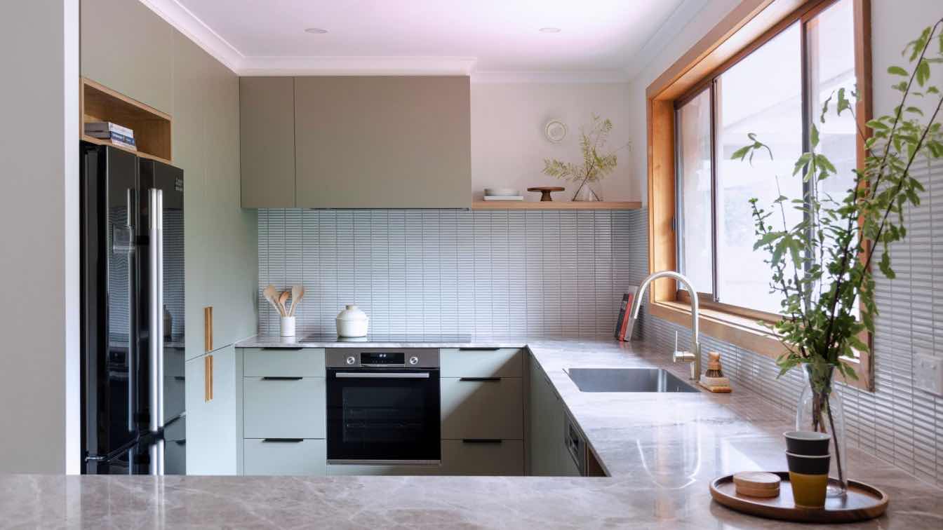
The 1970s were known for their bold and vibrant interior design, featuring natural materials, bold patterns, and open layouts. Our kitchen renovation pays homage to this era with its timber joinery and tiled countertops, while incorporating modern design elements for a fresh and minimal look.
We decided to preserve the original slate flooring to maintain a sense of continuity with the home's history and design choices of the past. The warm and natural texture of the original timber frame windows with their striking orange colour was popular in the 1970s and add a pop of colour and warmth to the space.
By combining these old elements with new design choices, we created a truly unique and memorable kitchen with a layered and complex feel.
Tell us a bit about the inspiration behind the colour and material palette…
The inspiration behind the colour and material palette was to reflect the 70s interior design style while also creating a modern and updated look.
The existing slate floor with its green, brown and orange tones provided the starting point for the colour palette.
Sage green, a popular colour in the 70s, was chosen for its muted yet warm tone that can create a calming and soothing atmosphere in a space.
The use of teak wood, a common material in 70s interior design, adds a natural and organic element to the space.
White Japanese border tiles, although not directly associated with 70s design, were chosen for their ability to create a rustic and organic feel when used alongside natural materials like wood, stone, and slate.
Beige and grey limestone countertops were chosen for their soft and textured feel, aligning with the natural and organic trend of the 70s.
The idea was to create a cohesive and visually pleasing design that reflects the 70s interior design style in a modern and updated way. By balancing these elements with contemporary design touches, a design was created that feels both nostalgic and fresh.
What’s your favourite part of the transformation and why?
We found that the harmony achieved between the old and new elements was the most appealing aspect of the transformation. Each material was chosen with great care and thought, resulting in an unexpected yet cohesive result that feels timeless and consistent. The combination of traditional materials like teak wood and limestone countertops with the modern and minimalist Japanese border tiles created a harmonious balance that feels well-balanced and complete. The use of sage green not only ties the floor throughout the house but also complements the surrounding environment.
This consistent colour scheme allowed the old and new design elements to blend together seamlessly without feeling out of place. We enjoy spending more time in the kitchen now and are pleased with how well the design flows throughout the rest of the house.