Exterior:
O&A Design studio have developed a modern interior concept for a flat in the pearl shades. The development is formed of three and seven storey houses that hold a subtle dialogue of old and new in the very heart of New York City. The housing development was designed by world famous architectural firms SPEECH and Reserve.
Spacious one-level and two-level apartments are on offer, with O&A designing 130-square metre one-level apartments that boast a beautiful layout and panoramic-view windows that face the historic part of the city. The modest, neo-classic style of the planned interior was inspired by the building’s modernist style as well as the client’s personality.
The Client:
Our client was very familiar with our company’s style and a big fan of our work. A well-educated, middle-aged family man with an impeccable sense of style and irreproachable taste, he was a very rare example of the perfect client who took an incredibly active part in all stages of this project.
Planning:
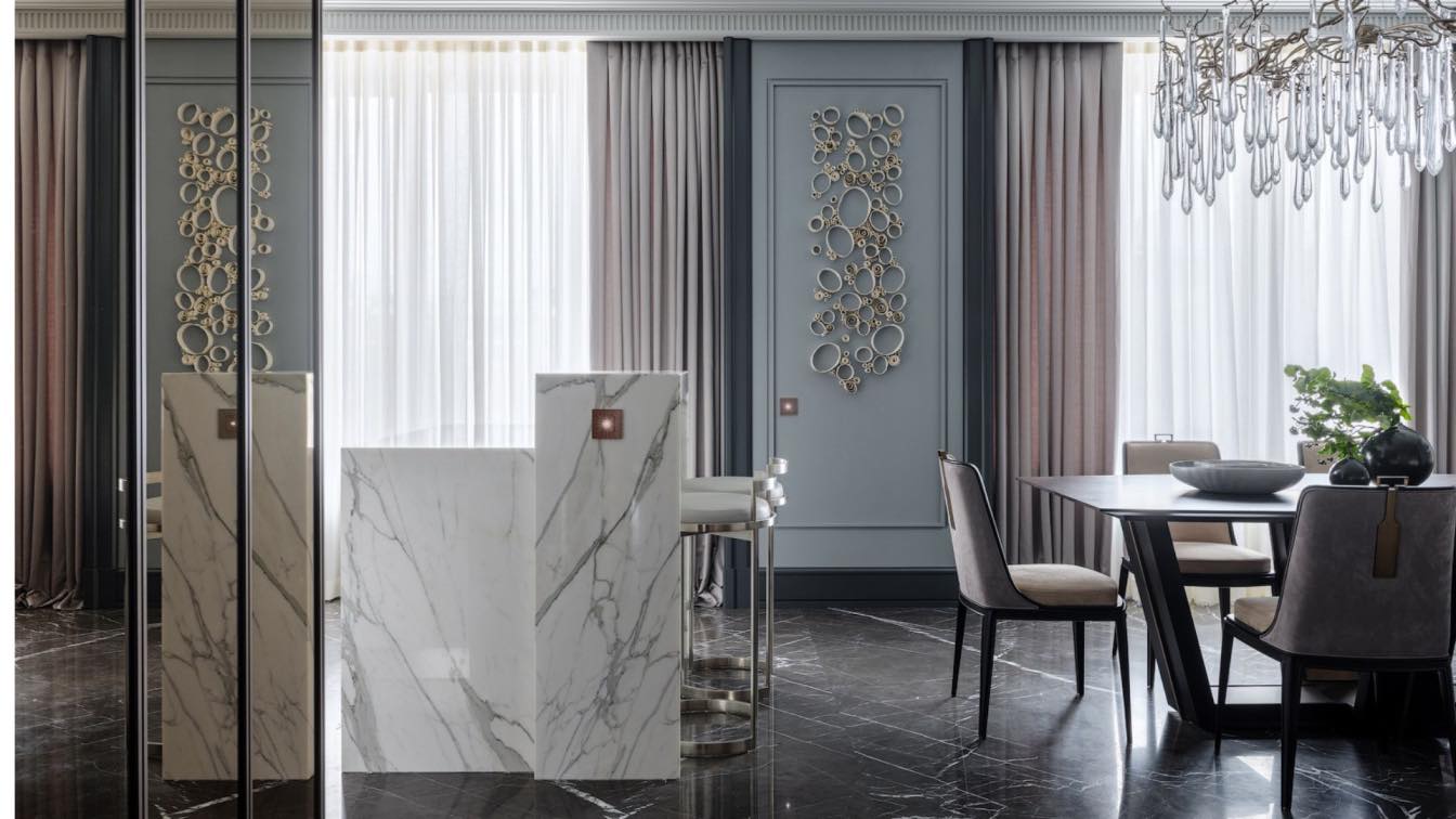
This apartment was not our client’s only place of residence for him and his family, which is why it was decided that it only needed two bedrooms – which left us a large open light space to combine the kitchen, hall, and sitting room. In order to help make the space seem even larger, we made the design decision to create the sitting room’s mirror wall. In addition to visually enlarging the space, this trick also gave the room a quirky, geometric shape due to the vertical positioning of the mirrors. This trick was utilised again in the dressing room, where we used volumetric bronze mirrors to give the space extra depth.
Meanwhile, we seamlessly integrated the kitchen into the open space, hiding it behind a marble island. Anna Agapova said of the design process: “Our aim was to seamlessly combine the kitchen and the dining area. There are no cupboards or shelves here and the border is marked by the thin copper pipes. This border between the spaces is counter balanced by an elegant porcelain installation by famous artist Valeria Nascimento”.
We also widened the space of the living area with the help of enclosed balconies, which turned out to be a hugely successful planning decision. The architects were also able to conceal the radiators, which meant that we didn’t have to move the central heating system.

Colours and Textures:
Speaking about the colours and textures used, Oleg Klodt said: “Our interiors are often jokingly called ‘50 shades of grey’. 90% of the time I do not think this comparison is fair but in this particular project we really did immerse ourselves in the world of many shades of grey. Here the cool and the warm tones are diluted by various types of metal. And due to this intricate play, the colour of the space works beautifully”.
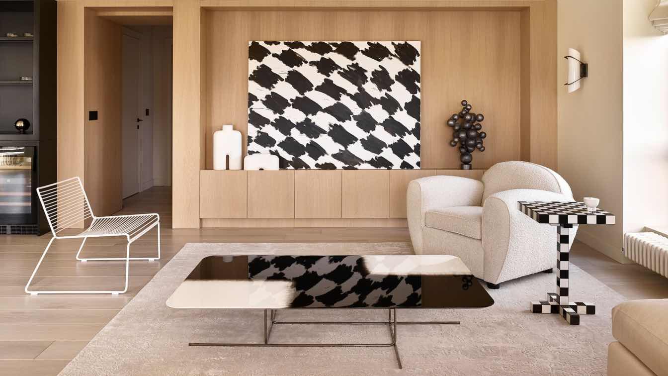
Anna Agapova added: “The choice of marble for the general area was quite an atypical move. Usually the clients are unsure about using this material but in this case the client trusted us and decided to take a risk. The intertwining ornaments of the work surface and the marble floors, paired with the mirror wall creates the feeling of multiple layers which is supported by the pattern of the hand-crafted rug by Thibault Van Renne and two paintings by a British artist Helen Fryer, whose landscapes have a very special atmosphere and are full of movement”.
Furniture:
The apartment is like a jewellery box - full of individual and unique items. O&A always pay extra special attention to decorative lighting in our projects and this interior is no exception. The designers approached the choice of light fixtures very carefully, selecting a chandelier by a British designer Louise Bradley for above the dining area, which instantly grabs your attention. In one of the bedrooms, the central light is moved into the bay window and the role of the main light fixtures is taken over by the suspended wall mounted lamps by Avrett.
Meanwhile, in the sitting room, the main attraction is a table by the unrivalled Tom Faulkner. The table’s aged-effect mirror resonates with a golden ornament on the wallpaper, giving it that extra touch and the perfect collaboration.
The central elements of the dining room are the table and chairs from O&A’s Oleg and Anna’s first furniture collection. The designers did not overload the living rooms with storage systems in a bid to leave as much open space as possible. A smart walk in wardrobe was designed for one of the bedrooms, and for the other Oleg Klodt created an elegant wardrobe. This wardrobe, as well as many others created by the architect, tells its own story of the generation and incorporates family traditions – establishing a strong connection between the furniture piece and the home’s inhabitants.

Materials:
The designers paid special attention to the overall general background of the space, which - despite its monochrome appearance - is marked by original detail. One of the bedrooms boasts handmade wallpaper from the Caledonia collection by Anna and Oleg, which was manufactured in collaboration with Holland&Sherry. The collection was inspired by the Scottish landscapes and the design used in this project (Staffa, Tranquil) imitates basalt pillars of the Staffa island. The poetic name of the colour is reinforced by the special tranquil atmosphere created in the bedroom.
Anna Agapova said of the design: “Despite the prevailing grey throughout this project, the interior turned out amazingly warm, saturated and enveloping. It transfixes you and allows you to rest and enjoy the silence and domestic bliss”.
Decor:
Discussing the project’s décor, Anna Agapova said: “In this project ‘original glass’ defeated ‘classic ceramics’”.
The designers actively used decorative vases by Henry Dean, unique in their colour and texture, which have become true jewels of the bedrooms. And for the finishing touches they used the work of the unrivalled masters, Wayne Charmer and Angela Jarman.
What was the project brief?
The brief was to create the interior for our client's residence in New York dedicated to the building's modernist style and the client's personality.
What were the key challenges?
This was not our client's first property, so we aimed to create something fresh and distinctive. Fortunately, we were presented with a generously sized open and light-filled space, allowing us to blend the kitchen, hall seamlessly, and sitting room into one harmonious area.
What were the solutions?
In order to help make the space seem even larger, we made the design decision to create the sitting room’s mirror wall. In addition to visually enlarging the space, this trick also gave the room a quirky, geometric shape due to the vertical positioning of the mirrors. This trick was utilised again in the dressing room, where we used volumetric bronze mirrors to give the space extra depth.