House of DC: Embedded in plain sight on a bustling street, Ardaas supermarket is gracefully situated on one of the main streets of Baddi city in Himachal Pradesh. Unlike most other supermarkets, Ardaas is designed to let people feel the infinite sensory expanse of space with muted aesthetics to highlight the display.
The focus is to create an engaging interaction between the customers and the products while invoking a sense of playfulness and refinement. The boutique store occupies an area of 335 square meters. The design intent for the storefront was to make it visible from the corner of the street, where old and low buildings line up the approach. Integral to this concept, the store signboard has been designed strategically with text written in two different dimensions.
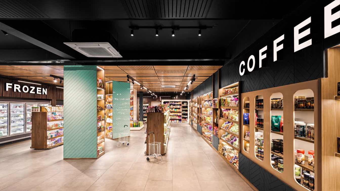
The bold, clear, and contemporary design breaks the noisy atmosphere of the street, resulting in an ardent ambience. The store starts with an open plan from where the movement takes place, in different directions. Having a confined but not entirely closed space with clear visual paths, gives the customers the freedom to create their own rules inside the store. By placing low height layers of racks and putting guiding signboards at a height, we intend to direct the users at the beginning of their journey.

Taking advantage of the 15 feet high ceiling, we suspended laser-cut, pre-laminated boards using aluminium channels between the beams, hiding all the services above.
The tall, wide pillars painted in refreshing colours break the space partially in the vertical direction and become the focal points here. The cash counter does the same but in the horizontal direction.
Metal racks, clad in oak veneer, and framed with LED lights, display a considerable chunk of products. Various vertical elements on wall racks divide the required horizontal shelves into multiple sections, making it visually easier to track down the items.
Since the client insisted on having some efficient storage areas within the store, the space above the wall racks serves as hidden overhead storage. The service and packaging area at the rear end of the building has a separate entrance.
It’s the natural touch of wood, the boldness of black and the crispiness of white that gives the already colourful display all the required space and attention.